 Mahindra Finance · Design System
Every screen started from zero
Before Rise there was no design system. Every button, every field, every spacing decision was rebuilt by hand on each new screen — which meant no visual consistency across products, and no shared vocabulary between design and engineering.
The real cost wasn't the redrawing. It was attention. Time spent re-deciding what a secondary button looks like is time not spent on the complex problems that actually needed designers. Rise was built to take those decisions off the table permanently — to increase speed and consistency, and hand the team back its focus.
Three tiers, one source of truth
Rise separates what a colour is from what a colour means. A raw palette sits at the bottom, a semantic layer names intent in the middle, and components only ever consume the top. Rebrand the middle layer and every screen follows — nothing downstream is touched.
Root palette
The raw values. Named for what they look like, never for where they're used.
CRT/Barn Red/$barn red 6
→ #691A1E
Core alias
Intent. Roles like Primary and CTA point at root values — this is the swap layer.
Token Core/Primary/P-6
→ $barn red 6
Component
Components bind to roles only. No component ever references a hex directly.
Button/button-primary
→ Primary/P-6
States get the same treatment — button-primary, -hover, -active.
Interaction feedback becomes a property of the system rather than a decision re-made on every screen.
Colour
Two brand ramps carry the identity; four extended families carry meaning and warmth across cards, states and illustration. Click any swatch to copy its hex.
Barn Red — Primary
CRT/Barn RedRising Red — Secondary
CRT/Rising RedGrass
CRT/GrassSky
CRT/SkyFlower
CRT/FlowerBird
CRT/BirdNeutral
CRT/Neutral ColorDark palette
CRT/Dark PaletteSemantic tokens
Status colour is paired, not single: a RAG value for the signal itself and a surface for the container it sits in. Pairing them at token level means a success message can never be assembled from a mismatched green.
Three of the four pairings fail AA when the RAG value is used as label text on its paired surface:
Success 3.79:1, Warning 2.51:1, Info 4.29:1.
Only Error clears it, at 6.73:1. The badges on this page therefore darken the label while keeping the
token surface intact. The system needs a third value per status — an -on-surface text token —
rather than reusing the RAG signal for two different jobs.
Typography
A two-typeface split with a clear division of labour: Quicksand carries voice, Karla carries information. Every style below is live text at its specified size, weight and leading — not an image of type.
Rounded geometric terminals keep large type approachable — the warmth in a category that usually reads cold.
A grotesque with tall x-height and open apertures, built to stay legible at 11–16px on dense financial screens.
Display
QuicksandHeadline
QuicksandTitle
QuicksandComponents
Every element below is built from the tokens above — no hardcoded values. They're interactive: hover, focus and press to see the state tokens resolve.
Button/button-primaryButton/button-danger-primaryBadge/*Atoms/InputBuilding Blocks/Tab Single UnitSurfaces & overlays
The four extended families exist to make dense product screens navigable — a category gets a surface, and users learn the mapping without reading a label.
Overlay/*Illustration
A single hand-drawn line style, always in Barn Red, set on one of the four tinted surfaces. Keeping illustration to one weight and one colour means it reads as part of the interface rather than decoration dropped on top of it.
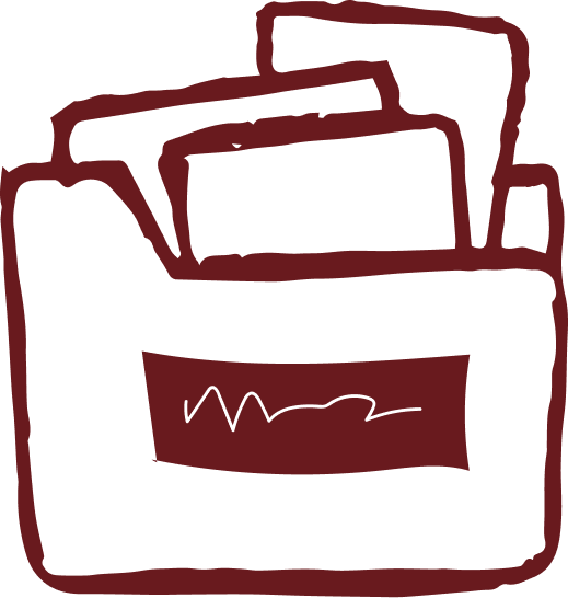

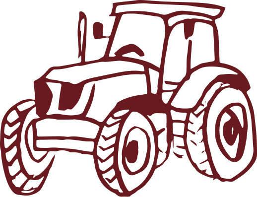
Every asset is drawn with the same loose, slightly imperfect stroke — closer to a sketch than a vector icon.
Barn Red only, line and fill alike. Never recoloured per product — the surface underneath does the categorising.
Always placed on a soft surface, never pure white, so the line keeps its weight against the page.
Accessibility
Contrast was measured across the palette rather than assumed. The results set real usage rules — a few values are deliberately restricted to surfaces and large type.
| Pairing | Ratio | WCAG AA | Rule |
|---|---|---|---|
| Barn Red 6 on White | 11.88:1 | Pass | Headings & body |
| Barn Red 6 on Bird | 11.02:1 | Pass | Text on tinted cards |
| Barn Red 5 on White | 7.74:1 | Pass | Headings & body |
| Error RAG on Error surface | 6.73:1 | Pass | Label text |
| Rising Red 6 on White | 4.72:1 | Pass, tight | Accent & ≥16px only |
| Barn Red 4 on White | 4.69:1 | Pass, tight | Secondary text ≥16px |
| Info on Info surface | 4.29:1 | Fail | Needs -on-surface token |
| Success RAG on Success surface | 3.79:1 | Fail | Needs -on-surface token |
| Barn Red 1–3 on White | 1.28–2.82:1 | Fail | Surfaces & borders only |
| Warning RAG on Warning surface | 2.51:1 | Fail | Needs -on-surface token |
| Tag copy on Dark 7 | 1.95:1 | Fail | Open — see note |
The dark mode currently overrides 3 of 76 tokens: body copy, display/heading, and Rising Red 6.
Surfaces, neutrals and semantic tokens still resolve to their light values, and tag copy
is mode-independent — so it drops to 1.95:1 on a dark surface. Dark Palette 1–7 exists and is the
intended fix; it just isn't aliased into the mode yet. Documenting it beats shipping it quietly.
What changed
Reduction in design–development cycle time, measured across handoff to build.
Every colour and type decision made once, at token level, instead of per screen.
Hardcoded values in component definitions — rebrands propagate from the alias layer.
The number worth caring about isn't the 40%. It's what the 40% freed up — designers arguing about lending logic and edge cases instead of button radii.